Styleguide
Design System
Typography
Manrope font family. Headings use font-weight 800 (extrabold), body uses 500 (medium).
Headings
Heading One
Heading Two
Heading Three
Heading Four
Heading Five
Heading Six
Text Variants (Typography component)
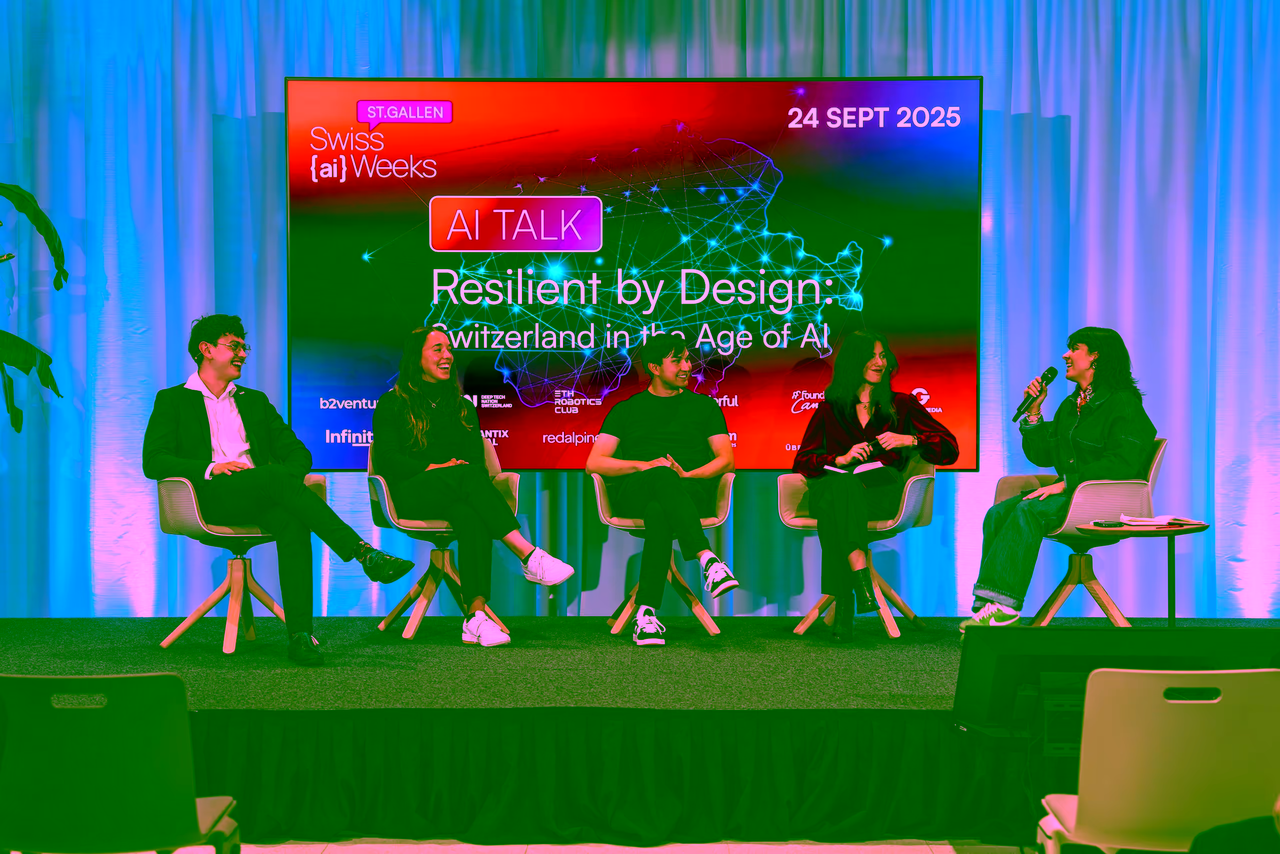
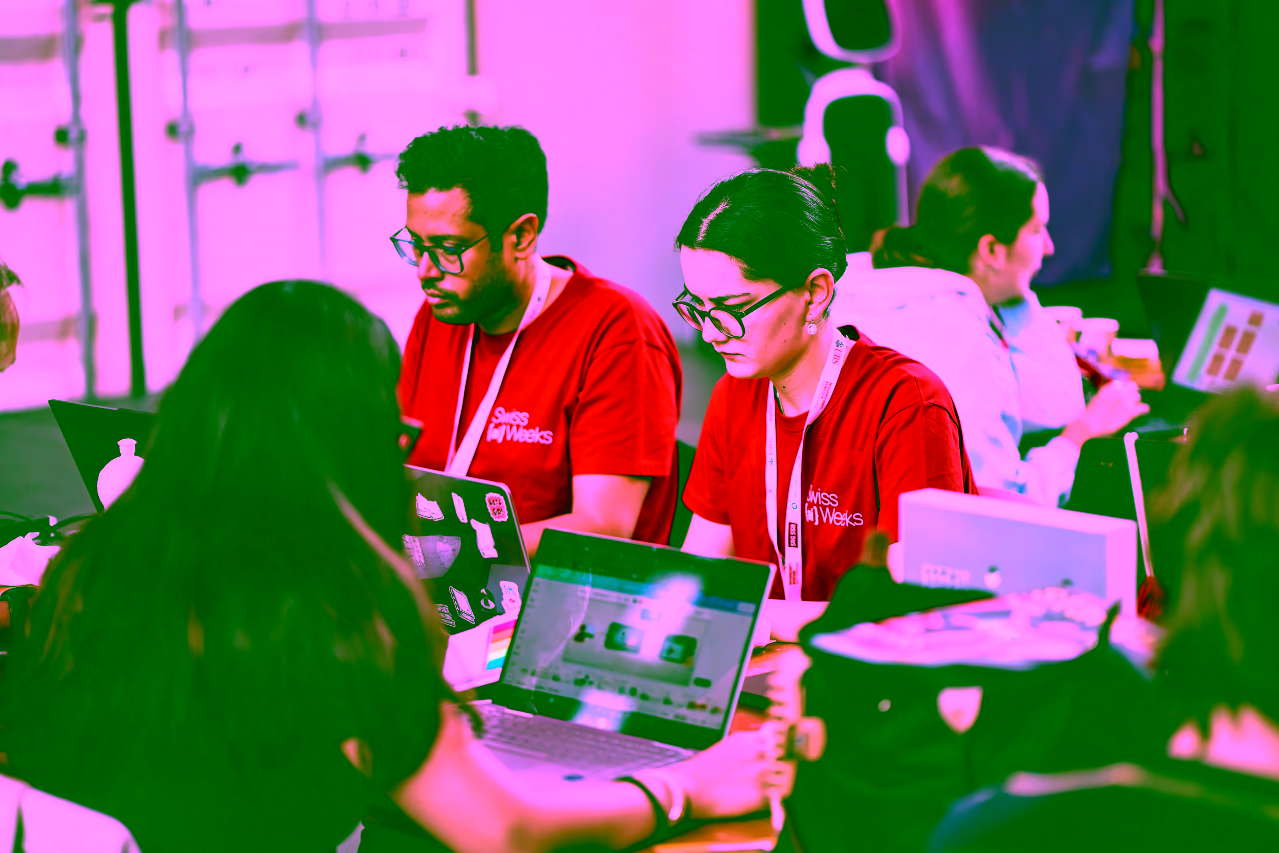
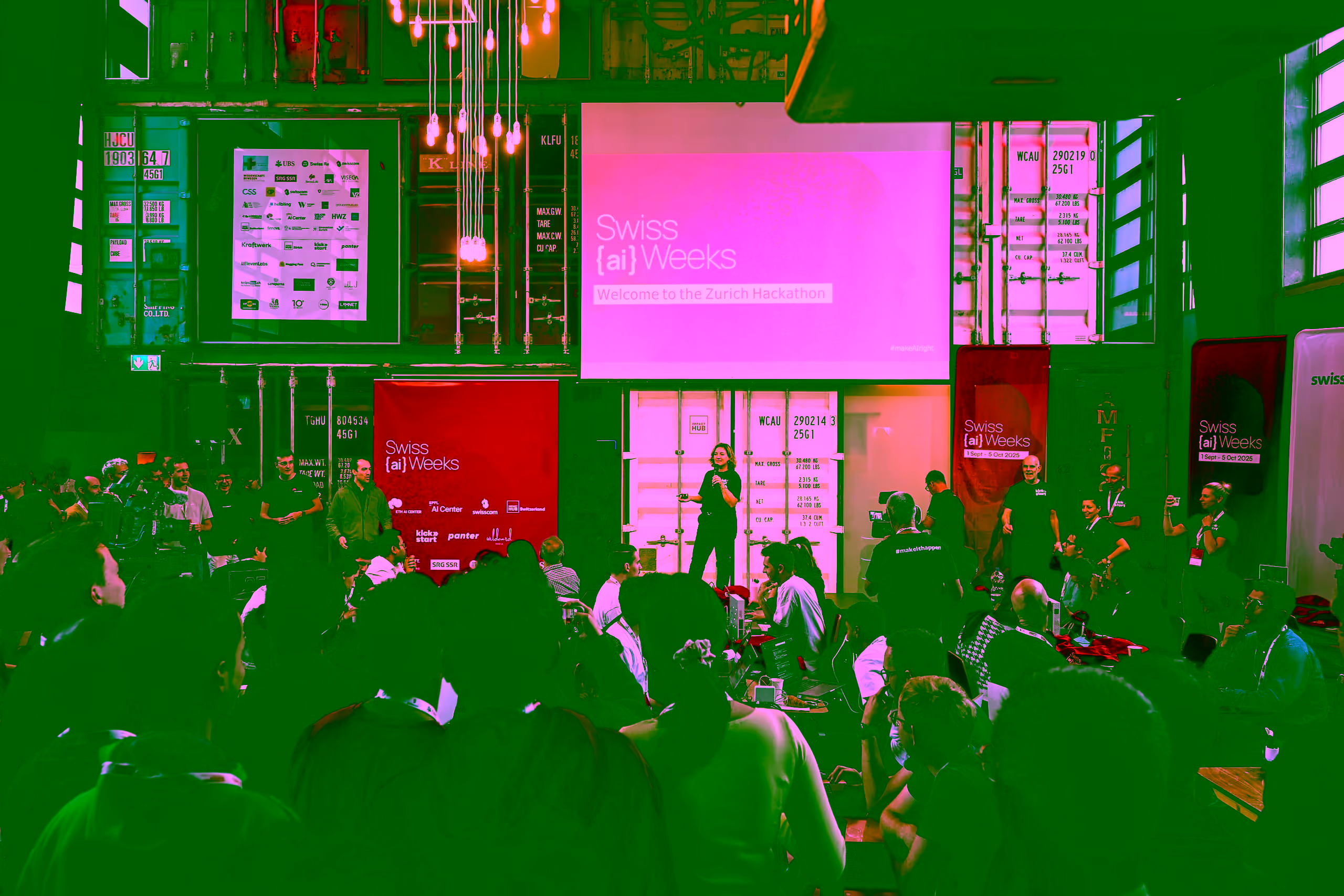
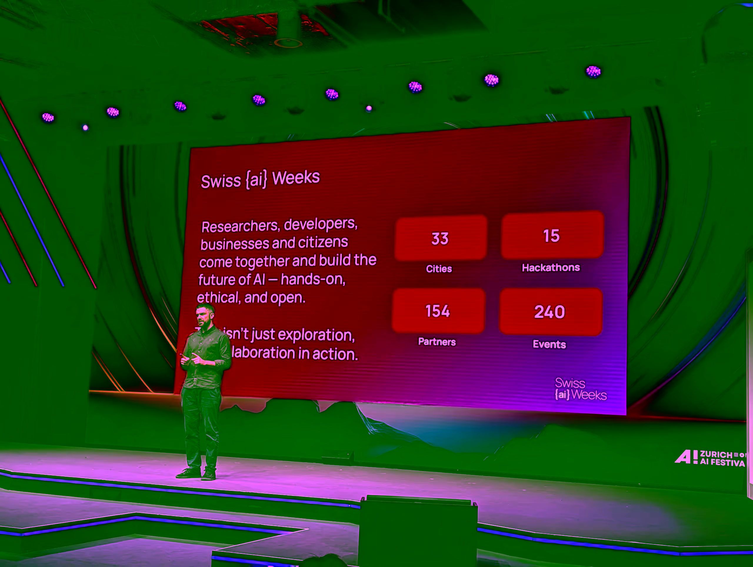
A visual journey through the events, the discussions, and the people shaping the future of AI.
Lorem ipsum dolor sit amet, consectetuer adipiscing elit. Aenean commodo ligula eget dolor. Aenean massa. Cum sociis natoque penatibus et magnis dis parturient montes, nascetur ridiculus mus.
This is small text used for secondary information.
Muted text for less prominent content
Inline Styles
Regular text with bold text and italic text and inline code and highlighted text and Ctrl+K
This is a blockquote. It uses a left border accent in the primary color.
Colors
Brand palette from Figma. All colors are defined as CSS custom properties using oklch.
Brand Palette
Purple/100
#220030
bg-primary
Red/100
#E4043F
bg-secondary
Lila/50
#CD86F3
bg-accent-lila
Lila/25
#E6C3F9
bg-accent-lila-light
Red/50
#F1819F
bg-accent-red-light
Magenta
#C9077E
bg-accent-magenta
Violet
#9C0EE8
bg-accent-violet
Grey/100
#E8E8E8
bg-muted
Grey/50
#F3F3F3
bg-accent
White
#FFFFFF
bg-background
Semantic Status Colors
Success
--success
Warning
--warning
Error
--error
Info
--info
Gradients
Pre-defined gradient tokens for backgrounds and overlays.
Brand
--gradient-brand
Teaser
--gradient-teaser
Marquee
--gradient-marquee
Card Overlay
--gradient-card-overlay
Badges
Small status indicators with variant support.
Form Controls
Input, Textarea, Select, Checkbox, Switch, and Label components.
Input
Textarea
Select
Checkbox & Switch
Cards
Flexible card container with header, content, and footer slots.
This is the main content area of the card. It can contain any elements.
1.2k
Visitors
340
Signups
Alerts
Contextual feedback messages with icon and variant support.
Feedback & Loading
Progress bars, spinners, and skeleton placeholders.
Progress
25%
50%
75%
100%
Spinner
Skeleton
Accordion
Collapsible content sections using Radix UI.
Tabs
Tabbed navigation for switching between content panels.
An overview of the event with key details and highlights.
Dialog
Modal dialogs for focused interactions. Uses Radix UI Dialog.
Avatars
User profile images with fallback initials.
Tooltips
Hover-triggered contextual information using Radix UI Tooltip.
Separator
Visual dividers between content.
Content above the separator
Content below the separator
Headline h3
This is a lead - Lorem ipsum dolor sit amet, consectetuer adipiscing elit. Aenean commodo ligula eget dolor. Aenean massa.
Headline h3
This is a lead - Lorem ipsum dolor sit amet, consectetuer adipiscing elit. Aenean commodo ligula eget dolor. Aenean massa.
Graphical Statement
Responsive brand graphic with editable text blocks for editorial page highlights.
Editable eyebrow
Optional editable heading for contextual use.
First editable pink row
Second editable pink row
Third editable pink row
Co-create, don't compete - build solutions together with an open, hands-on mindset
Shape the Future of AI in Switzerland - attract talent and create new opportunities
Drive the conversation nationwide - raise AI literacy across society
Content Section Variants
Background variants for page sections. Each wraps content in a container with responsive padding.
Default
White background with dark text. The standard content section.
Light (Grey/50)
Light grey background for subtle contrast between sections.
Dark (Purple/100)
Dark purple background with white text for emphasis.
Accent (Red/50)
Accent background using the lighter red tone.
Lila (Lila/25)
Soft lila background for a warm, distinctive feel.
Gradient (Brand)
Full brand gradient background for high-impact sections.
Hero Variants
Full-width hero sections with gradient backgrounds and decorative shapes.
Default Hero
Byline text
Secondary Hero
Centered Hero
Centered layout
Hero Banner
Split-layout banner with gradient background and arrow graphic.
1 September — 4 October 2026
Largest open movement for artificial intelligence.
Date Marquee
Scrolling date banner with gradient background and decorative brand mark.
Partner Marquee
Scrolling partner logos with pause on hover.
Partners so far